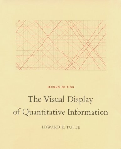
书名:The Visual Display of Quantitative Information
作者:EdwardR.Tufte
译者:
ISBN:9780961392147
出版社:GraphicsPress
出版时间:2001-2
格式:epub/mobi/azw3/pdf
页数:200
豆瓣评分: 9.1
书籍简介:
The classic book on statistical graphics, charts, tables. Theory and practice in the design of data graphics, 250 illustrations of the best (and a few of the worst) statistical graphics, with detailed analysis of how to display data for precise, effective, quick analysis. Design of the high-resolution displays, small multiples. Editing and improving graphics. The data-ink ratio. Time-series, relational graphics, data maps, multivariate designs. Detection of graphical deception: design variation vs. data variation. Sources of deception. Aesthetics and data graphical displays. This is the second edition of The Visual Display of Quantitative Information. Recently published, this new edition provides excellent color reproductions of the many graphics of William Playfair, adds color to other images, and includes all the changes and corrections accumulated during 17 printings of the first edition. This book celebrates escapes from the flatlands of both paper and computer screen, showing superb displays of high-dimensional complex data. The most design-oriented of Edward Tufte's books, Envisioning Information shows maps, charts, scientific presentations, diagrams, computer interfaces, statistical graphics and tables, stereo photographs, guidebooks, courtroom exhibits, timetables, use of color, a pop-up, and many other wonderful displays of information. The book provides practical advice about how to explain complex material by visual means, with extraordinary examples to illustrate the fundamental principles of information displays. Topics include escaping flatland, color and information, micro/macro designs, layering and separation, small multiples, and narratives. Winner of 17 awards for design and content. 400 illustrations with exquisite 6- to 12-color printing throughout. Highest quality design and production. Visual Explanations: Images and Quantities, Evidence and Narrative is about pictures of verbs, the representation of mechanism and motion, process and dynamics, causes and effects, explanation and narrative. Practical applications and examples include statistical graphics, charts for making important decisions in engineering and medicine, technical manuals, diagrams, design of computer interfaces and websites and on-line manuals, animations and scientific visualizations, techniques for talks, and design strategies for enhancing the rate of information transfer in print, presentations, and computer screens. The use of visual evidence in deciding to launch the space shuttle Challenger is discussed in careful detail. Video snapshots show redesigns of a supercomputer animation of a thunderstorm. The book is designed and printed to the highest standards, with luscious color throughout and four built-in flaps for showing motion and before/after effects.
作者简介:
书友短评:
@ Annie Easy to read, nicely printed. @ Ecthelion 我又向无救geek迈进了一步。此外,这书我觉得是开眼界用的,对我这种每每想起figure就只有那么几种概念的死脑筋来说,确实很有启发性。 @ GwQ 只是随手翻了翻。第一个例子给我留下蛮深的印象。 @ Hao 在美国就知道作者的大名。在北京读过电子版之后在 Thoughtworks 做了报告。反响不错。 @ Vamei 简明扼要的讲解定量数据的可视化。特别强调可视化对不同变量之间关系的呈现。反对为艺术效果而混淆或者简化数据。 @ 小短毛球 算是囫囵吞枣,大体上过了一遍,重点的几个原则和指标我记下了,其他东西感觉没多大用就没细看。看这本书大概一共花了四五个小时左右?最重要的几个原则:1.不要用饼图。2.减少不必要的视觉干扰。3.不要失真。4.不要创造duck。 @ cookie 十分实用,毫不枯燥。 @ Jay 两天在ua图书馆看这本书,属于启发式的。 Graphical elegance is often found in simplicity of design and complexity of data.
添加微信公众号:好书天下获取
 好书天下
好书天下
评论前必须登录!
注册